The Portfolio Edit: Rainbow
Robust reds and empowering pinks to warm yellow hues and cool blues, reflect back on our journey over the rainbow through our Portfolio Edit Series as we display our vast array of work through the spectrum of colour.
Colour as an Iconic Brand Asset
Colour theory is vital for branding. Emotionally, in terms of the feelings it evokes from consumers when they see it; but also, on-shelf, in terms of market standout. Take Natwest’s rebrand – introducing a vibrant purple to a sector saturated in a sea of blue, while continuing to signify integrity and ambition. The ability of a brand to effectively ‘own’ a colour amidst a pool of lookalikes, can offer substantial competitive edge, achieving instant recognition – in some cases even without a logo or brand name. That’s the power of colour, done right.
The Colour First Approach
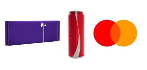
Look to some of the most iconic brands including Starbucks and Mastercard that have taken on the colour first approach. Dropping their names and embracing their strong visual identities, these brands are owning colour to prompt consumer recognition and represent a unique brand personality. Safe to say, colour conveys emotions faster than words. Be it a red can of ‘Happiness’ or a shiny purple wrapper that tastes of ‘Royalty’, these unique colourways invoke feelings and perceptions for a brand beyond measure. There’s no denying that the right colour can elevate your brand and make it truly iconic.
Our work from one end of the rainbow to the other

Carex
We redesigned an upmarket, contemporary, distinctive and ergonomic design that elevated Carex from the sea of imitators. The transparency and purity of the pack are a direct reflection of what is in it – Carex is a brand that people know and trust.

Shell
The relaunch of Shell’s Helix (car), Rimula (truck) and Advance (motorcycle) brands was Shell’s largest ever design program. It was a Goliath effort to give such a vast product portfolio global consistency. Bluemarlin were responsible for the architecture reconfiguration, positioning and designing of the entire lubricants portfolio, which extended to gear oil, brake fluid, industrials and car care products. Each brand now works off a performance-based tiering system better communicated through clear on-pack descriptors while having a distinctive colour scheme to differentiate across the overall brand portfolio.

Bluemarlin was also tasked with the brand strategy, concept development and naming for Shell V-Power Nitro+ which flaunts a bold “Ferrari Red” across all its touchpoints. Action, performance and power are well associated with this fierce red and conveys the brand identity and offering of a highly premium and advanced fuel.
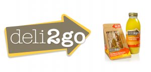
Shell Deli2Go – Food brand strategy – Our dynamic, directional, appetising and brilliantly adaptable design and colour system for Shell’s Deli2Go brand enabled it to look just as delicious on a poster as on a sandwich pack. It made the whole service station environment a sunnier, more scrumptious place to be.
“We wanted to change people’s perceptions of garage food and drink and make Shell’s offer a positive choice that drivers would go that extra mile for. Our work achieved that in style and the sales figures speak for themselves,” Andrew Eyles, Global CEO, Bluemarlin.
Spike Losing the gold colour of the old logo and sticking with stark contrasts of black and white, our redesign of the Spike logo is a bold typeface with a strike through the middle. The visual Expression succinctly encapsulates the brand’s bold, disruptive movement forward.
“One of the greatest assets and one of the easiest ways to sway decision or attract an emotive response – or alienate a consumer – is through colour.”
– June Mcleod, author of Colour Psychology Today