The Portfolio Edit: Blue
Inspired by The Home Edit, the #getorganized divas of Instagram and Netflix, we decided to share 25+ years of our brave work through the spectrum of colour. We’ll be dusting off award-winning designs and groundbreaking work from yesteryears and arranging them in a colourful system. Cataloguing the projects that put us on the map, the lost gems that shook up categories and the brave designs that set us apart – from random to rainbow.
Something blue…
It’s the colour of the oceans and the heavens above, associated with calmness, depth and tranquillity. One of the most common colours for a uniform, conveying authority, order and trust. Cool and clear, it is a universal symbol of clarity of mind and peace of spirit. And sometimes, blue can set the scene for a story like no other…
Putting the blue in bluemarlin
Looking though our archives, you’d guess that we’ve got a soft spot for the colour blue – and you wouldn’t be wrong. We’ve used this hue on all sorts of products from skin moisturiser to bottled water to artisanal gin. It has helped us illustrate the authority of a dental care brand and create legendary intrigue in the cider category. It’s a blue world after all…
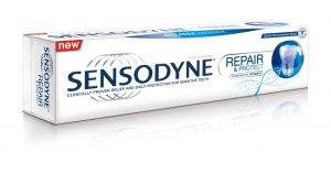
Sensodyne
We used blue to create a single universal language for Sensodyne that could communicate its superior benefits worldwide.
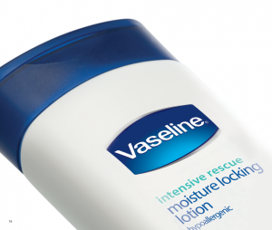
Vaseline
Our refreshed design of Vaseline’s trademark lozenge echoes the brand’s iconic petroleum jelly jar in two-tone blue.
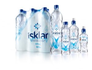
Isklar
The purity of Norwegian natural spring water comes to life in this crystal blue logo.
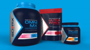
SCI-MX
Our redesign of leading sports nutritional brand SCI-MX uses blue to drive the scientific credibility of its protein-packed formulations whilst also motivating consumers to achieve their personal best.
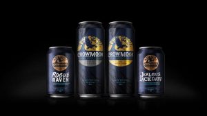
Crowmoor Cider
Midnight blue with accents of cyan enchant the eye and set the tone for a Crowmoor Cider legend.
Keen to see our current portfolio? Head over to www.bluemarlinbd.com