The Portfolio Edit: Yellow
Bright, energetic and optimistic, yellow is a powerful color that literally highlights reasons to be happy. At the same time, however, its attention-grabbing power is effective in signalling alerts and warnings. In branding, it is often used to communicate value and accessibility, but can also be used to convey modern premiumness when applied in the right way. And there’s just no way to have a delicious good morning without the golden glow of yellow…
They call us mellow yellow
As the brightest colour of them all, yellow’s stand-out power cannot be denied and cannot be ignored. These tensions between economical and exceptional, optimism and caution, wholesomeness and playfulness makes yellow a truly dynamic tool in brand design.
We’ve used yellow a host of times, helping brands bring a positivity and joy into their consumers lives. From conveying refreshment for brands like Schweppes to energising personal care for Set Wet, yellow has served its purpose in making brands stand out and get noticed.
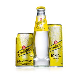
Schweppes We are the ones who brightened Schweppes trademark yellow to communicate freshness and vitality. (We also redesigned the signature structure, inspired by the brand’s original 1783 bottle.)
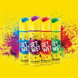
Set Wet We shook up the Indian men’s hair category with this bright, impossible-to-ignore yellow redesign.
KOFF Launch Pad Unabashedly bold and distinctively playful, our yellow design for KOFF Launch Pad pops off the shelf with quirky personality.
Keen to see our current portfolio? Head over to www.bluemarlinbd.com