Bluemarlin crafts identity for Collins & Collins’ debut offering, Mosca
Mosca, a new cold brew coffee mixer, has recently debuted with a visual identity created by brand acceleration agency bluemarlin. This is the first offering from adventurous flavour-house Collins & Collins, a new consumer-facing brand from Think Drinks.
Think Drinks wanted to capitalise on the rapid growth of cold brewed coffee with a product that meets the needs of health-conscious consumers. Additive free, fuss free and heat free, Mosca is the bartender’s solution for a perfect espresso martini. Beneath a broody exterior, Mosca has a subtle flavour that delivers a natural caffeine hit with a finesse of natural sweetness and incredible freshness.
Bluemarlin was tasked to create a brand identity that reflected the dark art of coffee blending with packaging that is utterly beautiful and desirable. The design needed to be strong enough to have immediate and compelling impact to appeal to professional bartenders whilst flexible enough to be developed into new variants in the future.
With the creative direction of being deceptively soft, the brand identity and packaging is an elegant marriage of strength and gentleness. It also tells an an alluring story…
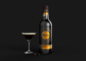
Mosca means ‘fly’ or ‘insect’ in Portuguese. The is a reference to serving Sambuca with ‘con la mosca’ or ‘with a fly.’ This is symbolic of the three beans representing health, happiness and prosperity. An elegant and abstract depiction of these flies are the key feature of Mosca’s new design.
The strong and slender wordmark sits within a rich golden circle with a single fly in the background. The intricate snowflake pattern surrounding the logo on the dark bottle is a discreet use of the fly motif, whilst also communicating coldness. These golden flies appear once more in a circular formation on the neck of the bottle with the inscription, ‘Health, Happiness, Prosperity.”
Bluemarlin was also tasked with creating a brand identity for Collins & Collins that reflected the new company’s values of mastery, power and liberation.

The new logo cuts the Collins’ C in two halves to represent the two personalities of the Collins brothers. As the product developer, John Collins is creative and expressive. This is reflected in the identity’s imaginative depiction of invention and blending. Tom Collins has built his reputation on providing the foundations for growth, which is conveyed in its solid base. Together, they cut through the bland offerings in the market with extraordinary products that have a strong consumer appeal.
“It was liberating to work with Think Drinks on creating identities for Mosca and Collins & Collins,” comments David Hodgson, Creative Director of bluemarlin. “Their vision to disrupt the category with extraordinary products gave us the license to be imaginative and provocative, whilst their commitment to craft and quality allowed us to create something really beautiful. We recognised quickly that small things matter, and this motivated our forensic attention to detail when crafting the identities for Mosca and Collins & Collins