From craft to icon: Reed’s Ginger Beer’s “Radical Evolution”
Bluemarlin was tasked with driving the “radical evolution” of Reed’s Ginger Beer with a strategic approach and design that would help the brand take a bold step forward in securing its iconic status as America’s #1 ginger beer. The challenge was to propose a creative solution that had real longevity, offering style as well as substance in order to resonate with a new generation of adult soft drinkers.
To determine how to make the brand’s equities both authentic and iconic, bluemarlin developed a new brand manifesto, which they termed “A Tasteful Mash-Up.” This inspiring idea identifies and celebrates the contrasts that create Reed’s unique, dynamic taste experience – the pungent bitterness of real, fresh Peruvian ginger blended with the citrus and spices of Jamaica, delivering a flavour that is harsh, yet soft; challenging yet comforting.
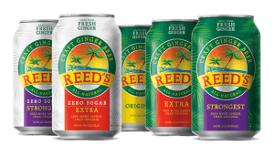
The redesign expresses the beauty of these contrasts with vivid intensity, playful energy and natural simplicity. An illustration of a two palm tree swaying on the shore at sunset immediately puts us in the island mood. A rich colour palette of red, green and gold unites the range and encapsulates the brand’s Jamaican spirit, whilst silhouettes of large palm leaves in the background create texture on pack. The brandmark has been given stronger prominence at the centre of the badge, a clear demonstration of Reed’s iconic status.
“Redesigning Reed’s was a great opportunity to elevate a truly authentic, craft brand to its rightful place as an icon,” comments David Hodgson, co-founder and Creative Director at bluemarlin. “To do this, we turned up the volume on what makes Reed’s different and special – its unique flavour profile, its connection to provenance, its commitment to quality. Focusing on these things and stripping away the rest, gives the brand a stronger and more confident presence on shelf and in the market.”