Battery Energy Drink rebrands with a +positively striking new identity
International strategic brand design agency bluemarlin has rebranded Battery Energy Drink, a portfolio of energy drinks from Finland’s leading brewery Sinebrychoff. Supporting the brand’s new ‘Reach for More’ positioning, the confidently charged new identity is set to hit market in over 20 countries worldwide.
For over 20 years, Battery has celebrated strength and determination by providing energy products promising to, ‘keep you going.’ To appeal to consumers looking for a boost to perform at their best and reach their goals, the powerhouse brand needed a new identity and packaging solution that reflected its mission to transform everyday challenges into easy wins.
Bluemarlin was tasked with developing a brand story that supported Battery’s ambition to make energy drinks an integrated and playful part of daily life, strengthening the brand’s identity for a more iconic presence across all touch points, and create a packaging system that energised and united the portfolio at shelf.
Relative Energy
Liberating Battery from the category conventions of extreme energy and full-throttle adrenalin, the new identity challenges the perception of what energy means. It’s not about jumping over rooftops and setting the world on fire. Rather, its focus is on making each day count with a design that boldly elevates the brand with aspirational spirit and accessibility.
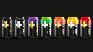
Battery’s core equities have been strengthened by cutting the clutter and amplifying its wordmark. Capturing the essence of power as a dynamic moving force, that is constantly in motion and never static, the new identity gives purpose and meaning to its new plus (+) sign. Reflecting the way energy is always changing, ebbing and flowing as we move through our daily lives, the positive symbol is now a more integrated part of the brand mark. On pack, it supports shelf standout whilst also serving as an organising device for portfolio architecture. Off pack, the plus sign works as a framing device, providing windows into the occasions where Battery can provide that little boost of extra energy to help you enjoy those small, but important, wins.
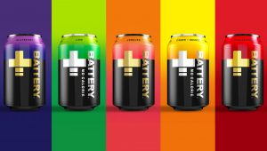
Whilst the core colours are Battery Gold and Battery Black, vibrant colour is used to further support the brand’s portfolio architecture. Expressed through tonal gradients that are both bold and dynamic, colour demonstrates the brand’s creativity whilst also communicating flavours.
Katie Eaton, bluemarlin’s Creative Director New York comments, “Battery wanted to transform their energy drink into something you can carry as confidently as you carry a coffee. We did this by applying a bold minimalism aesthetic, pulling out the brand’s equities and making them ownable and meaningful. We then injected dynamism by adding movement and colour to give the brand a more vivacious presence across all touch points.’
Alexander Sneen, Vice President of Marketing at Sinebrycoff comments, “Battery has found its unique voice in the extreme drinks category as a brand that understands how small wins make a big difference. The refreshed identity by bluemarlin sends this message powerfully into the market with newfound enthusiasm, yet without sacrificing an ounce of Battery’s authenticity. It’s an iconic, dynamic and vibrant new beginning for a brand ready to challenge the category with a refreshing new perspective.”
—
Bluemarlin is a strategic brand design agency committed to liberating brands from the ordinary. Independent in spirit, we combine strategic depth and creative adrenalin to ignite brand acceleration.
To view our portfolio and connect with our team, please visit www.bluemarlinbd.com