How to redefine pack design for export success
There’s a huge difference between designing a package for home and close-to-home markets and creating a pack that will be understood and appreciated overseas. To get around this, many brands have sought to ‘internationalise’ their identities, creating ‘culturally neutral’ personalities that can be understood by myriad nations.
Humour, metaphors, phrases and symbols specific to the country of origin are put to one side to avoid confusion; colourways and cues adapted to hit common ground. Sometimes this is the best strategy.
But a problem arises when a brand’s authentic sense of self is inextricably linked to its region, its history, its unique traditions. How, then, does the strategic designer convey that important, heartfelt messaging so that it can live in the hand, heart and mind of all consumers, wherever they’re located?
Reinterpreting design
Obviously, it’s not as simple as translating the words on pack and hitting print. Take fine wine from France as an example. Vintage, winery, appellation, quality, where it’s bottled – it’s all there, on every label. All you need to know is how to interpret all the scripted text around the decorative illustration of a château, right? If only it were that simple.
Of course, for the French winemaker there are strict laws governing the information that must appear on pack, but there’s scope beyond charming images of stately homes and calligraphic fonts. If your label is your calling card, you need to think long and hard about how you’re going to use it to communicate with new audiences and find your way into their lives.
While the shift from region to grape as a key signifier has been hard to swallow for many vintners who prioritise terroir, several are doing a good job of balancing the two – addressing global market trends without letting go of important local differentiators.

Reaching new markets
There are all kinds of things to consider, including compliance and regulations and different retail environments. Consumer expectations and perceptions in different parts of the world will have notable distinctions, too. There are marked category cues that unconsciously influence people’s perspectives within their own markets. Consequently, brand and category recognition at point of purchase can vary. Plus, local culture and consumer understanding also play a key role – how much a person knows about the product will dictate what needs to be applied to the packaging in terms of visual information.
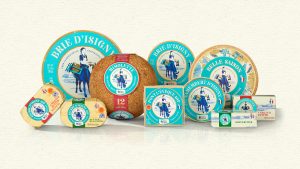
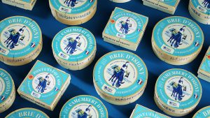
When we started working with French dairy Isigny Sainte-Mère to develop a new identity to heighten brand awareness in overseas markets, we knew that ‘culturally neutral’ wouldn’t work. But the results still had to fly abroad, especially in the USA.
The dairy has a long and proud history, rooted in the terroir of Normandy. The farmers have always maintained their commitment to the region and the traditional ways of producing dairy, so it was imperative the new design respected that legacy.
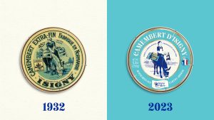
We looked to Isigny Sainte-Mère’s rich and distinctive history. Marthe the milkmaid and her donkey – brand icons since 1909 – were revitalised and are now central to the story once again, but with a more streamlined look and feel. In recent years, Marthe had been overlooked in favour of ubiquitous bucolic scenes. In her refreshed role, she expresses the care, attention and love that Isigny Sainte-Mère puts into all its products in a way that can be understood universally.
The dairy’s connection with the land has been conveyed in a more visual fashion to resonate with wider audiences. We created subtle watercolour images of products and scenery to evoke a sense of a connection to the terroir in a way that everyone will be able to appreciate. A new teal shade reflects Normandy itself, and speaks of the waterways, meadows and marshes of the region where the cows graze. There are fewer words on pack, less idiosyncratic imagery.
Balancing innovation and tradition
Many brands worry that by broadening their market horizons they’ll reduce their identity and with it some of their integrity. But boosting accessibility and dumbing down are two very different things. Country of origin, craft and quality can all be expressed in ways that speak to new audiences without compromising heritage.
America may be the home of Cheez Whiz, but the truth is people all over the world, including in the USA, are developing a greater appreciation for real food, from real places, made by real people, with real integrity. Brand owners and their strategic packaging design partners need to remember that when they’re approaching new markets.
In the dynamic world of business, of course concerns arise when a brand contemplates broadening its horizons. The fear, quite understandably, is that in reaching out to new audiences, the brand may lose the very essence that defines it.
But a brand can embark on a journey of growth while staying true to its roots. The key lies in creativity and effective communication. By strategically showcasing elements such as country of origin, or the artistry and artisanry behind its products and its unwavering commitment to quality, a brand can resonate with and attract fresh faces without compromising its values. Simply put, growth and preservation need not be at odds.