Buckwud
plant based 'gudness'
context
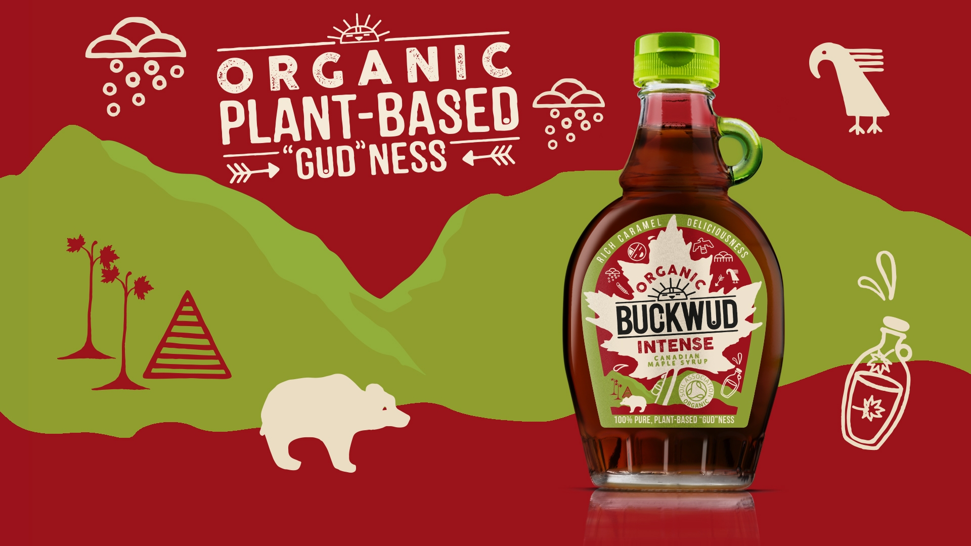
Buckwud began its life in the UK as a premium brand with a quirky Canadian personality. It is now the single largest branded maple syrup on the market, loved for its distinctive taste and used as a natural, plant-based option to alternative sweeteners. Bluemarlin was briefed to refresh Buckwud, dialling up its strong credentials as an organic, pure, plant-based product whilst amplifying its unique character to achieve a stronger shelf-standout.
journey
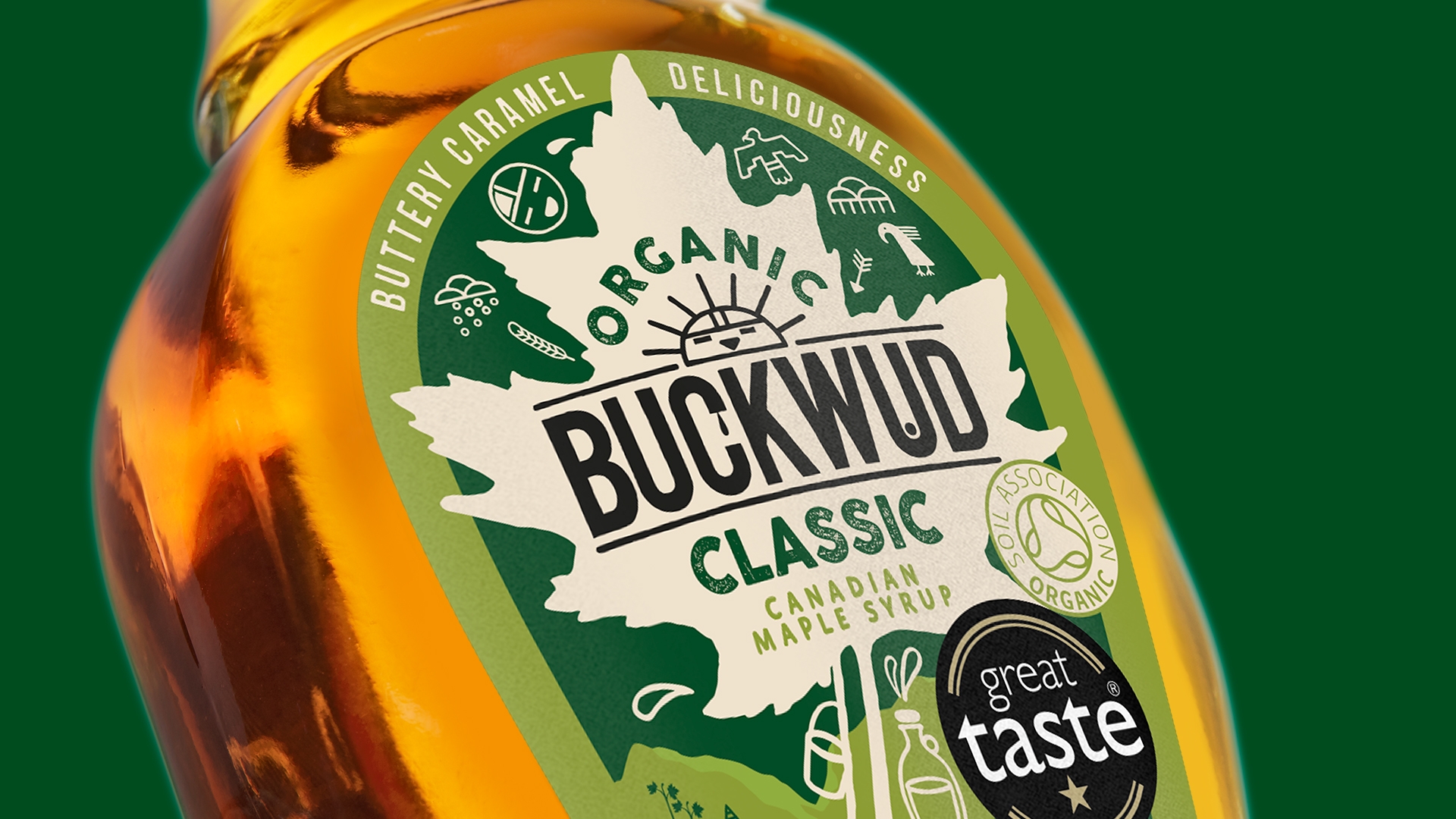
Buckwud has several design attributes that give it a wonderful presence as well a strong recognition as a premium brand. Our redesign needed to retain that positioning whilst prioritising these visual assets in a way that created greater clarity, enhanced its unique character, and improved brand standout on shelf.
The new design cuts back on the clutter to deliver a stronger brand impact. A natural green colour scheme reflects its 100% pure and organic credentials whilst also adding vibrancy and approachability. Copy is clear and characterful, introducing a new dimension to the brand that is both proud and playful.
results
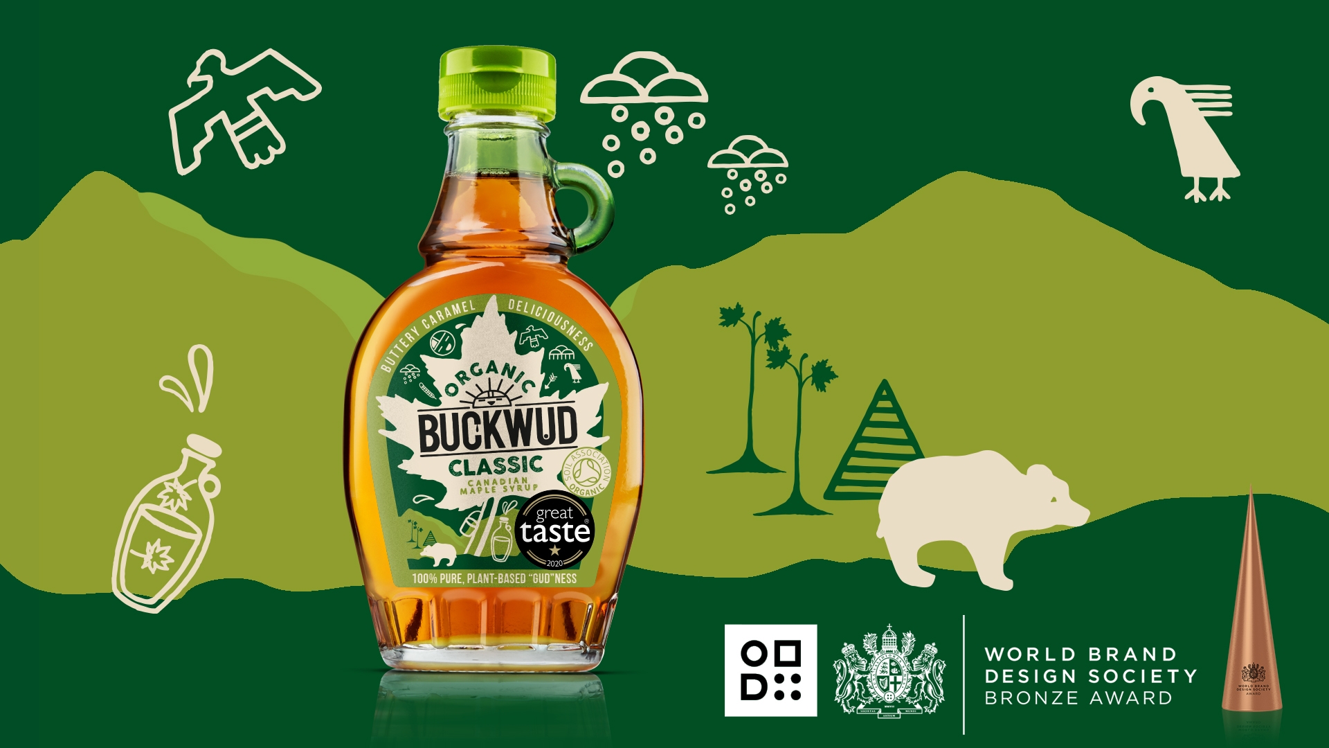
Following relaunch, sales grew 33.8% over a 52 week period based on Nielsen data, increasing RSV to over £5m, and driving Buckwud forward as the number one maple syrup brand in the UK.
“Buckwud has always told a brilliant provenance story through design. In this latest evolution, the brand has found the confidence to allow itself to be simple, reinforcing its credibility as a natural product.”
in the words of the client
“Buckwud has been on an incredible journey ever since it was introduced into the UK market. Bluemarlin’s lovely impactful new design revitalises the brand with newfound energy and zeal. We hope it will help us introduce Buckwud to new consumers who find great value in great taste.”
– Hanenne Madi – Brand Manager at Valeo Foods –