Thatchers
new life for an old rascal
context
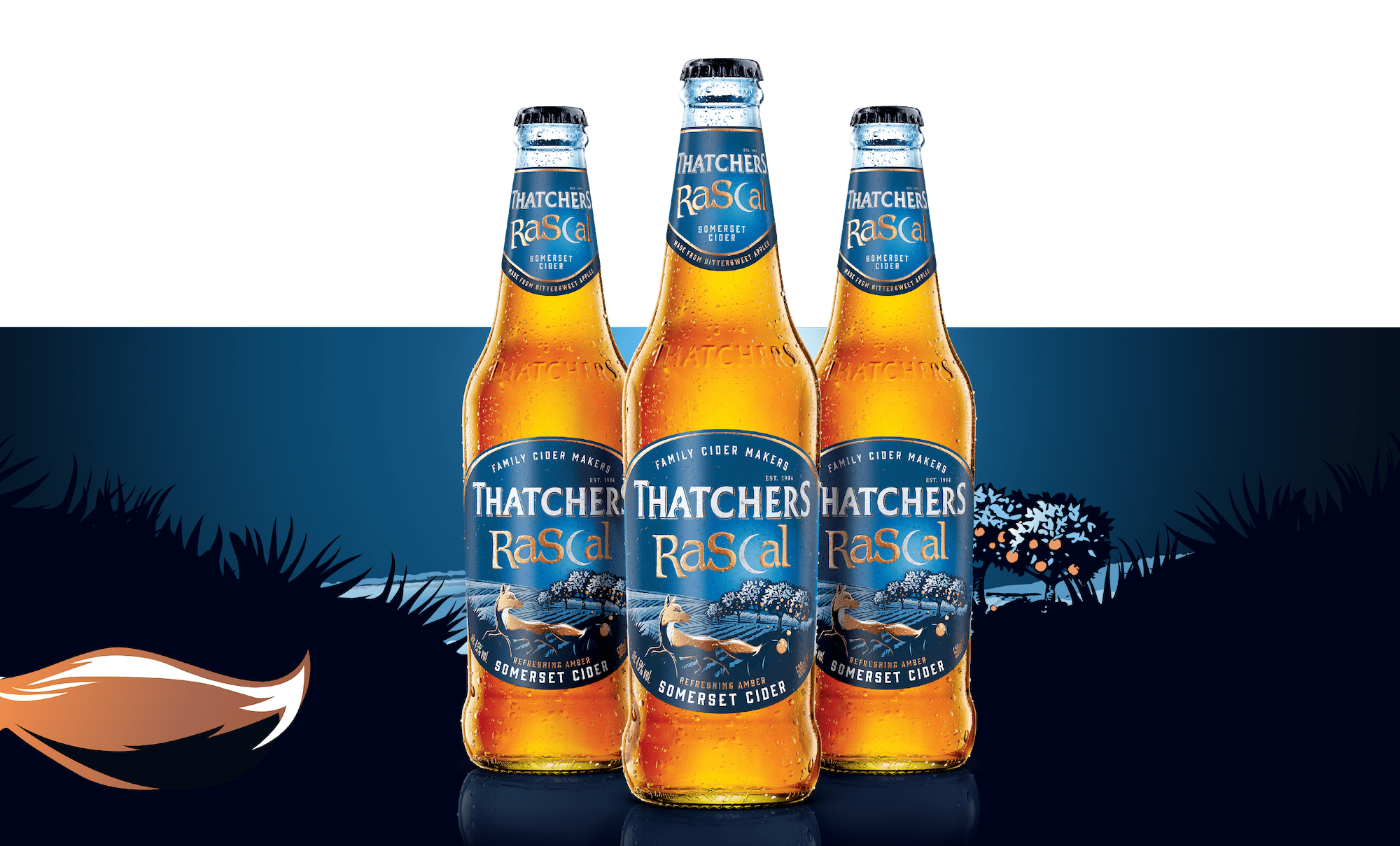
Thatchers Old Rascal was a great-tasting, long-standing product with the ability to be fun and playful. Its brand, however, was not standing out at shelf or appealing to the target audience. Its story had lost its thread and needed to be reimagined to reflect the brand’s promise of bringing intrigue and taste complexity to an often predictable drinking experience.
journey
The challenge was to strike the right balance between authenticity and attitude, to create a premium and contemporary design that would captivate the target audience whilst communicating Thatchers’ credibility. In simplifying the name, Thatchers Rascal now has a modern identity that is refreshingly bold.
The new wordmark cleverly incorporates the crescent moon, whilst the metallic finishing of the rest of the lettering elevates the brand’s premium credentials.
Its updated colour palette of dark midnight blues and rich coppers creates a dramatic effect whilst also setting the tone for a new brand story.
the results
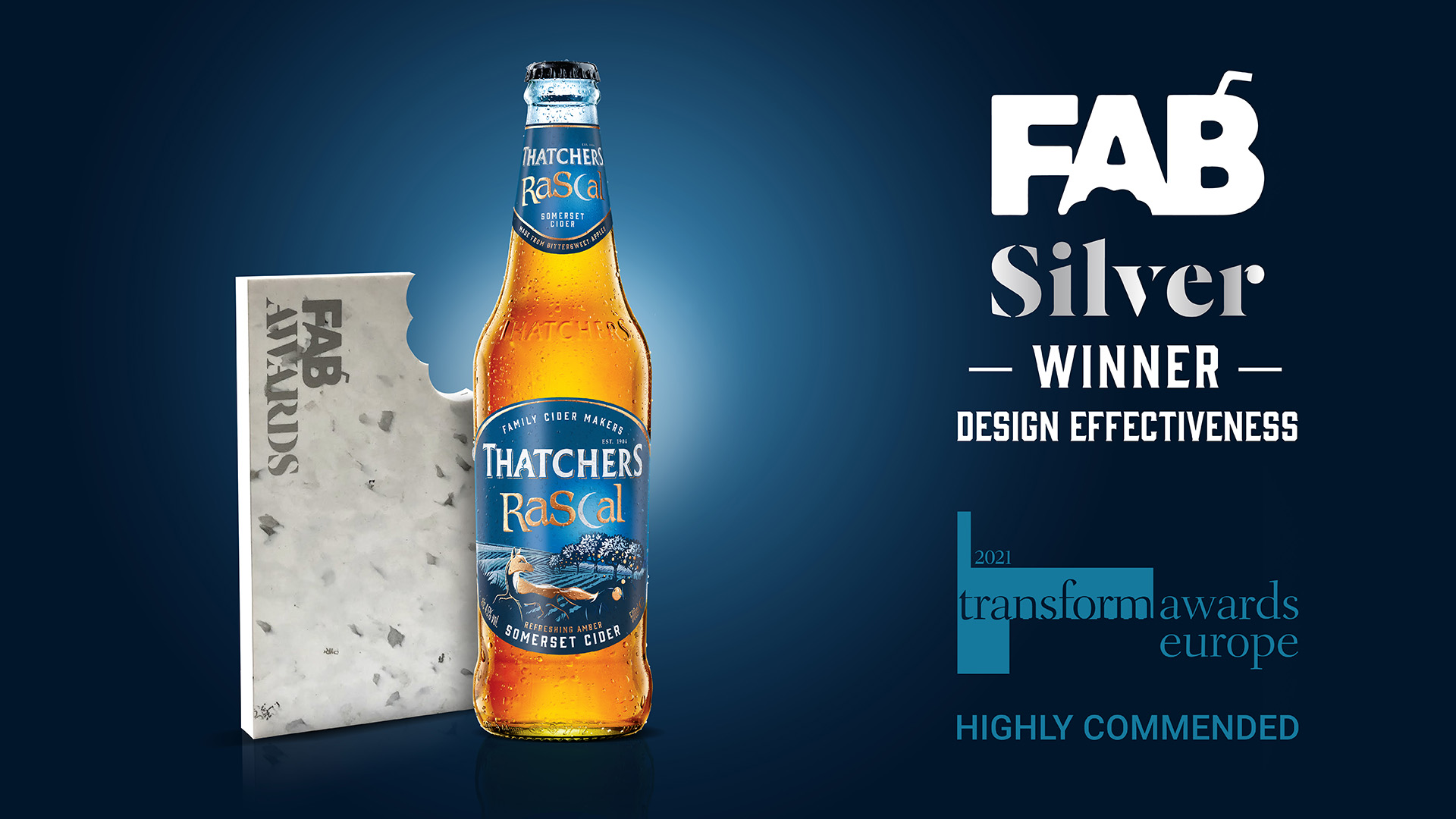
Now known simply as Thatchers Rascal, the captivating new design hit shelves nationwide in 2019. It quickly snatched Silver at the FAB Awards in 2020, showing a 9.5% year-on-year increase in sales volume and 5.9% increase in value, all while the category was in general decline.
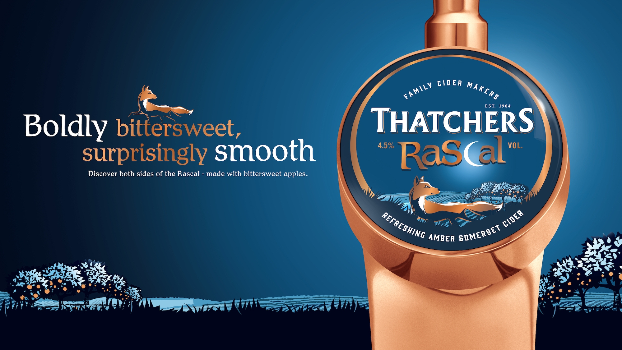
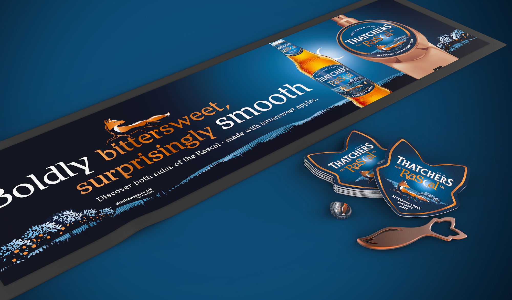
“The fox is now an amber silhouette in the light of the moon – a protector of the orchards, only venturing across Myrtle Farm under the cover of darkness.”
in the words of the client
“With its perfect balance of bittersweet smoothness, Thatchers Rascal has always been a gem in Thatchers’ portfolio.
Bluemarlin’s creative solution has re-energised the brand, giving it an opportunity to tell a powerful new story that is sure to appeal to curious cider drinkers looking for a refreshing discovery of great taste, premium craft and unmatchable quality.”
Yvonne Flannery, Head of Brands at Thatchers.