Ayurveda science
Dabur Red needed to evolve its identity as protector of all the family, with a modern scientific edge that reaffirmed proven natural efficacy, whilst becoming more relatable to the next generation.
The Brief
Renew Dabur Red’s mastery of oral care problems, projecting its natural ayurvedic powers, further strengthened by scientific advancements in clinical oral care efficacy.
BRAND STRATEGY • VISUAL IDENTITY • PACKAGING DESIGN
Context & InsightWith an exponential growth of global oral care players entering the Indian market, the new generation of consumers were no longer so confident to rely on ancient wisdoms and natural healing powers. Dabur Red believed by amalgamating nature with science it could boldly grow from No 2 brand to lead the category, perfectly positioning itself to meet all consumer needs, concerns and challenges.
With an exponential growth of global oral care players entering the Indian market, the new generation of consumers were no longer so confident to rely on ancient wisdoms and natural healing powers. Dabur Red believed by amalgamating nature with science it could boldly grow from No 2 brand to lead the category, perfectly positioning itself to meet all consumer needs, concerns and challenges.
The Idea
A seamless flow
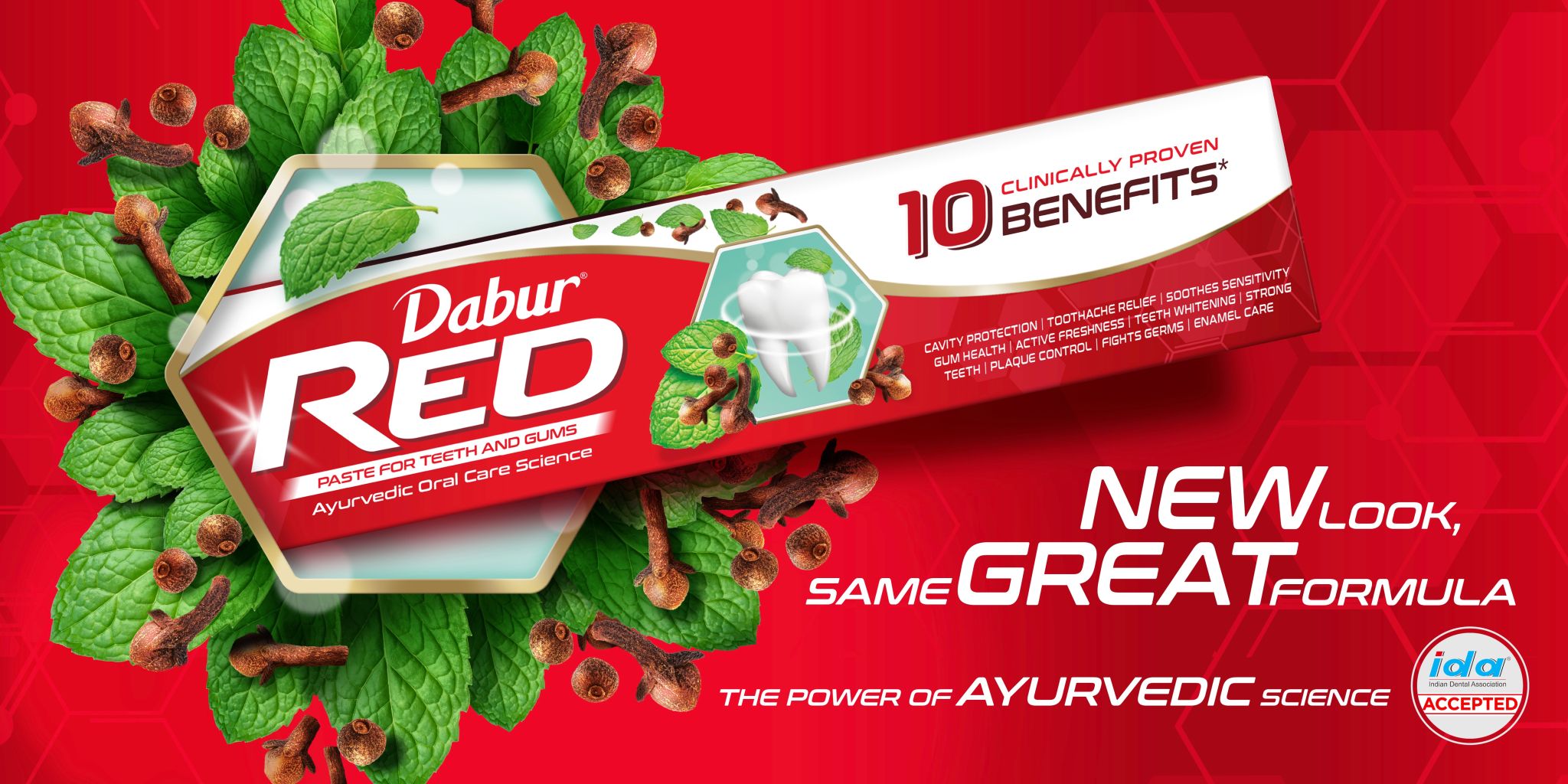
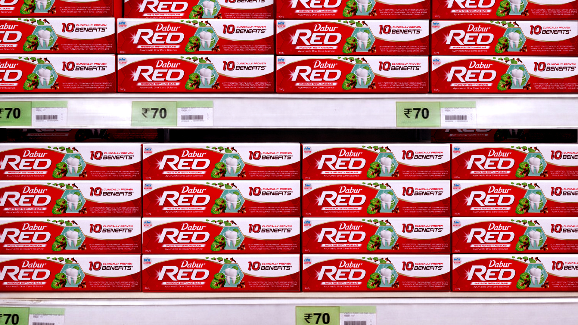
Symbolising harmony of Ayurveda & Science, the wave is our signature asset. Forming a tessellation across packs at shelf, it lifts brand confidence, elevates freshness, and creates a sea of ‘Red’, achieving striking impact in a competitive context.
Expression
The new Red Identity unites the wisdom of Ayurveda with the precision of modern science to convey trust, care, and efficacy in every detail. Manifesting the legacy of the Dabur masterbrand ‘Eye’ and transforming it into the ‘Red’ wave that signifies assured efficacy, and a continuous commitment to innovation.
With more focus on the new simplified Brandmark, the identity builds on scientific prowess through use of hexagons, cellular structures found in nature, supported by illustrations of plant and herbal ingredients encapsulating the tooth to showcase the activation of nature.