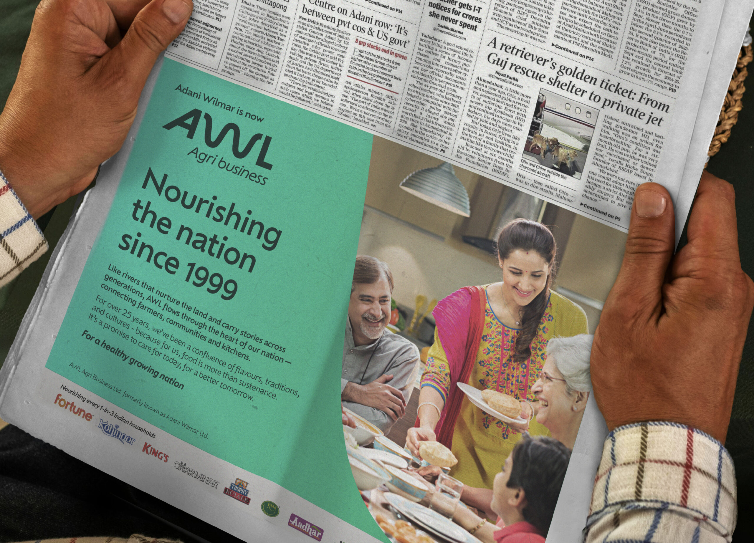
Nourishing the nation
A new progressive visual identity that transforms Adani Wilmar into AWL Agri business as a forward thinking enterprise that defines the values of its new era.
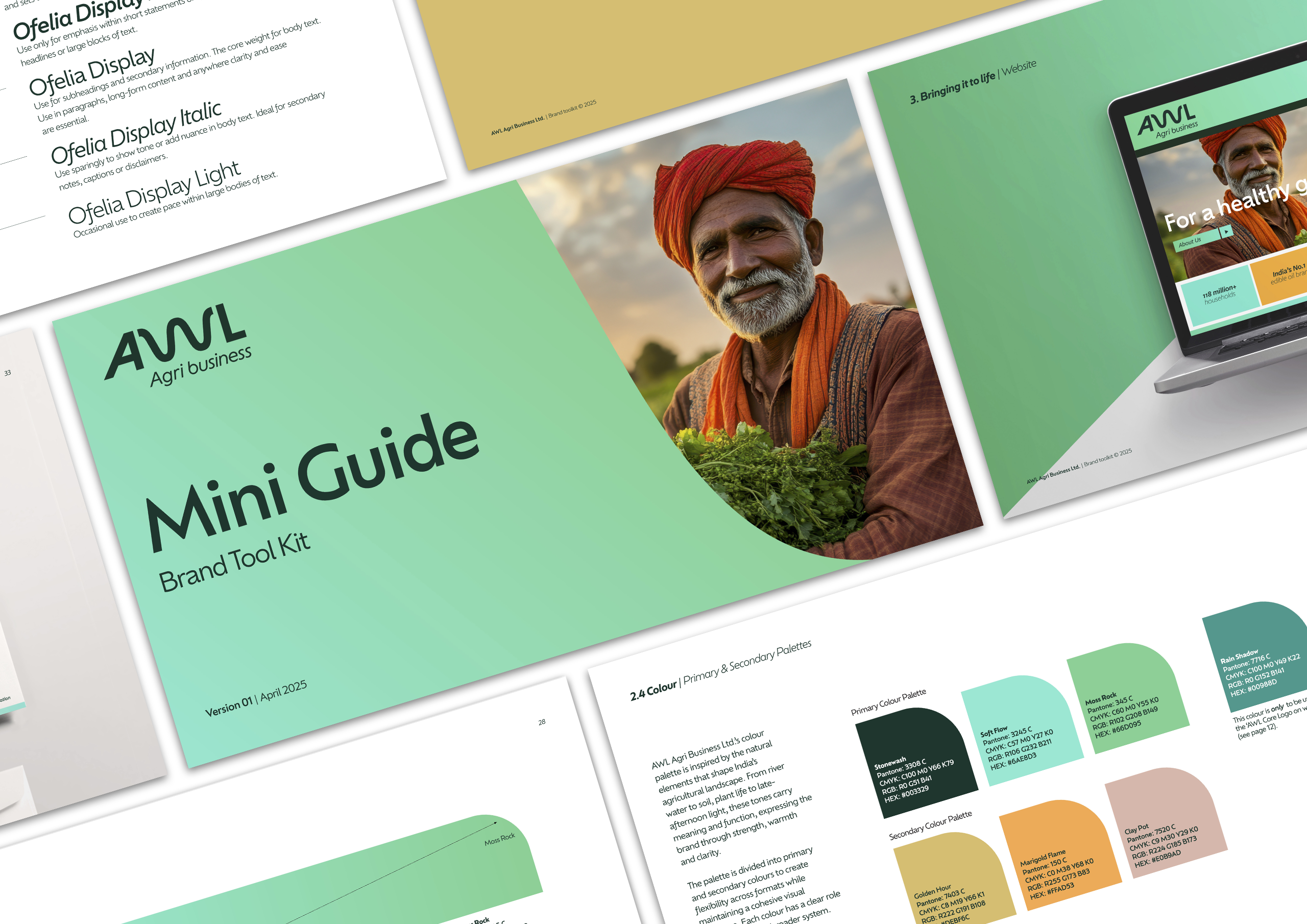
The Brief
To reimagine Adani Wilmar as ‘AWL Agri business’ , with an expression that captures the continuity of past to future, an unbroken chain of agricultural heritage to prosperity for all, where abundance transforms into family strength, where tradition meets ambition.
BRAND STRATEGY • VISUAL IDENTITY • LAUNCH MATERIAL
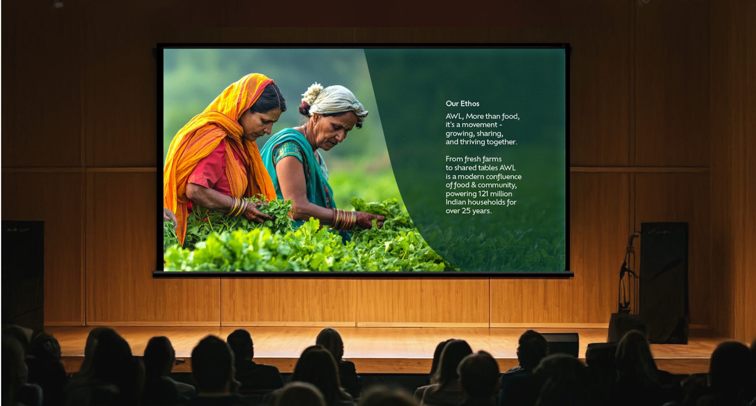
ContextAWL wants to be the definitive agri business leader, to expand its reach beyond the current domestic 121m households it serves, to forge a deeper emotional connection between rural farmers to urban consumers, and explore international growth.
As AWL’s foundational archetype is the Caregiver, we crafted a new corporate manifesto ‘For a Healthy Growing Nation’, build on the values of nourishment, continuity, integration, reliability and advancement.
AWL wants to be the definitive agri business leader, to expand its reach beyond the current domestic 121m households it serves, to forge a deeper emotional connection between rural farmers to urban consumers, and explore international growth.
As AWL’s foundational archetype is the Caregiver, we crafted a new corporate manifesto ‘For a Healthy Growing Nation’, build on the values of nourishment, continuity, integration, reliability and advancement.
InsightThe brand update comes at a time of significant transformation across India’s business growth, each day surging possibility into reality, and exploration to discovery.
Just as rivers connect vast territories, AWL connects agricultural prowess with modern innovation. It’s a network that ensures seamless flow, sustaining and strengthening those on its course, unifying the entire food system – from farmers to families.
The brand update comes at a time of significant transformation across India’s business growth, each day surging possibility into reality, and exploration to discovery.
Just as rivers connect vast territories, AWL connects agricultural prowess with modern innovation. It’s a network that ensures seamless flow, sustaining and strengthening those on its course, unifying the entire food system – from farmers to families.
The Idea
Sangam
The idea of ‘sangam’, a sacred meeting of rivers, aligns the brand with themes of integration, nourishment, resilience and shared prosperity. It reflects not only what AWL delivers, but what it enables – a future where sustenance fuels progress.
The Expression
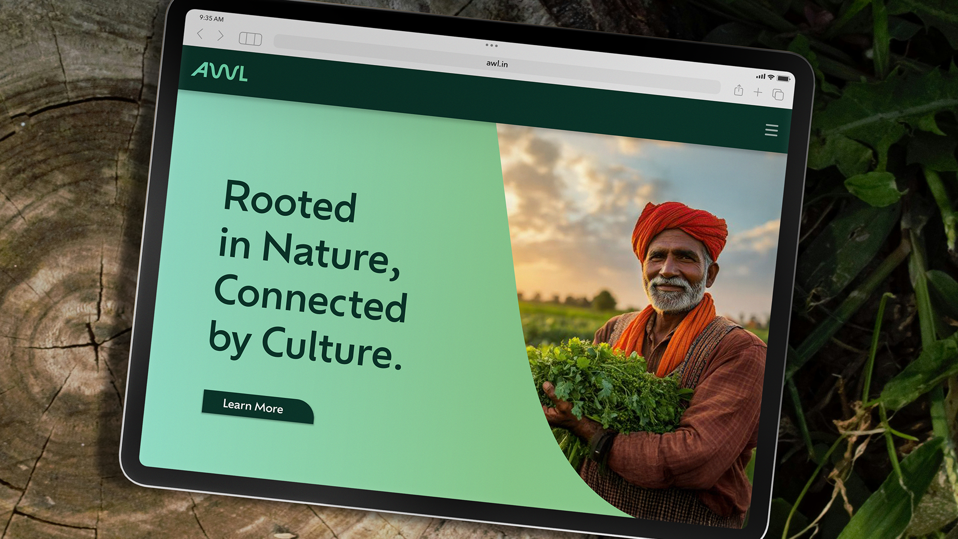
At the heart of the new identity is the metaphor of a river confluence – a place where waterways merge and move forwards as one. The new identity symbolises the seamless energy between farmers, industries and consumers. Just as rivers sustain the nation’s agricultural strength and link its diverse cultures, so too does the core philosophy of integration and connection guide every step of this brand refresh, from cultivation to consumption.
The expression revolves around the principle of connectivity, where the ‘W’ character symbolises the river meandering through to connect ‘A’ and ‘L’, just as rivers connect the length and breadth of India. Complimented with a modern colour palette led by turquoise hues of cascading river water, and typography that conveys energy and optimism, the new Identity system connects vibrantly with stakeholders.
Results
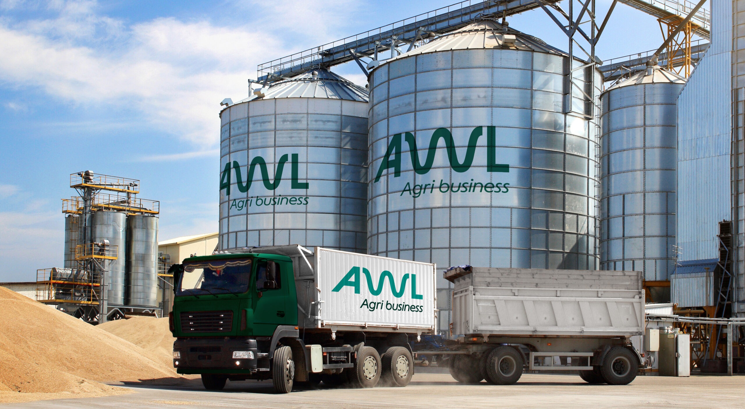
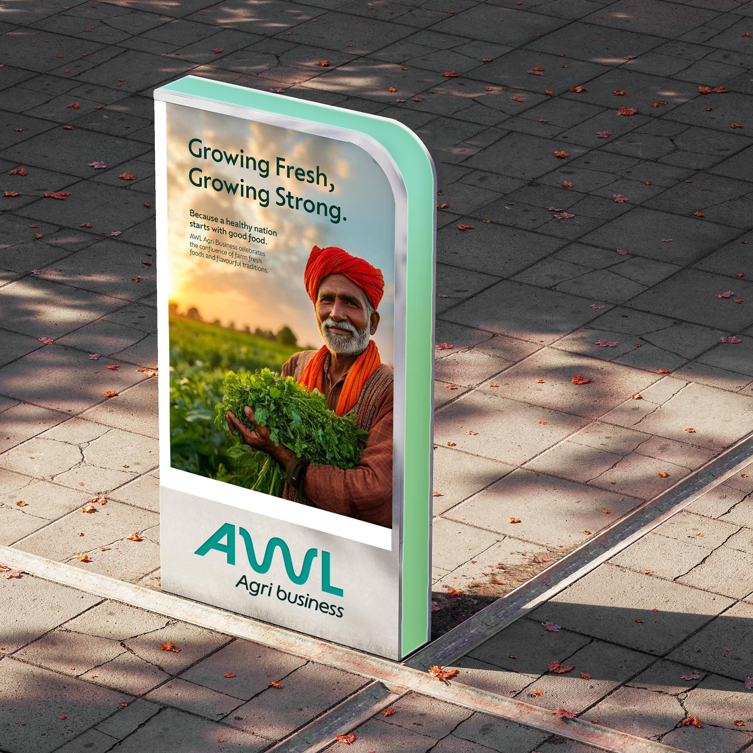
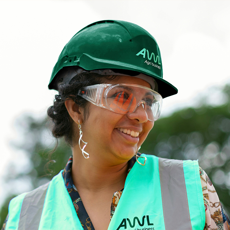
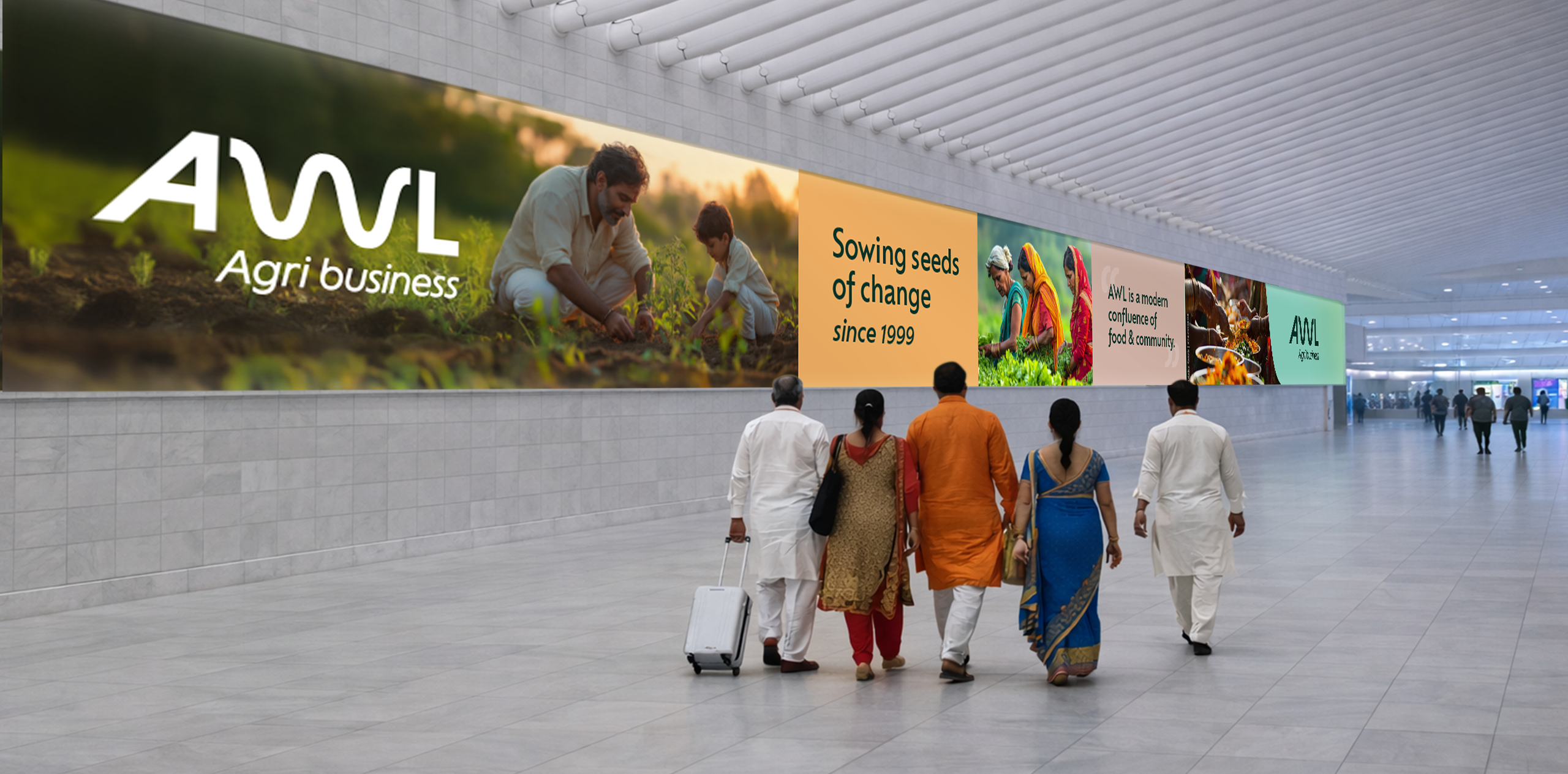
The new brand was launched publicly to investors within two months of briefing in mid ’25. It’s being rolled out across packaging, digital platforms, corporate materials, commercial and manufacturing sites, employee touchpoints and retail spaces. Future applications include motion identity, and wider global communications.

“The new identity uses flowing forms inspired by rivers to express continuity, momentum and connection,” said Samantha Dumont, Executive Creative Director at bluemarlin. “The overall design is forward thinking in its execution against its competitive set, conveying the progressive nature of AWL. It also reflects the company’s ability to adapt while remaining linked to its roots.”

“This rebrand is more than a new look – it’s a clear statement of who we are and where we’re heading,” said Mr Angshu Mallick, CEO of AWL Agri Business. “Bluemarlin‘s strategic thinking on our corporate positioning has led to a rich articulation of our proposition, giving us an emotive language and a striking identity that amplifies the real benefits we bring to our customers, consumers and the nation’s wellbeing every day.”